
The Process
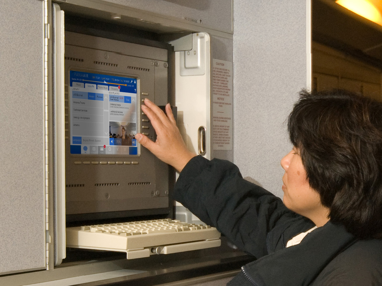
This was the first crew graphical user interface (GUI) that I developed for Panasonic. At that time, I had recently transitioned to Customer Engineering, and my role was to revamp the existing GUIs used by airlines, focusing on improving their visual appeal and functionality. I collaborated with a team that was dedicated to introducing new innovations and enhancing an outdated system.
To gather insights for the new interface, we organized usability workshops where airline crews visited our installation in Lake Forest, CA. Their input was invaluable in understanding their preferences, including what features could be added, what could be streamlined, and how to make it more user-friendly. Additionally, several engineers accompanied flight crews on international trips to observe the software in action and gather feedback directly from those using the systems.
The outcome of this collaborative effort was a more efficient and visually appealing crew interface that was well-received by major carriers.
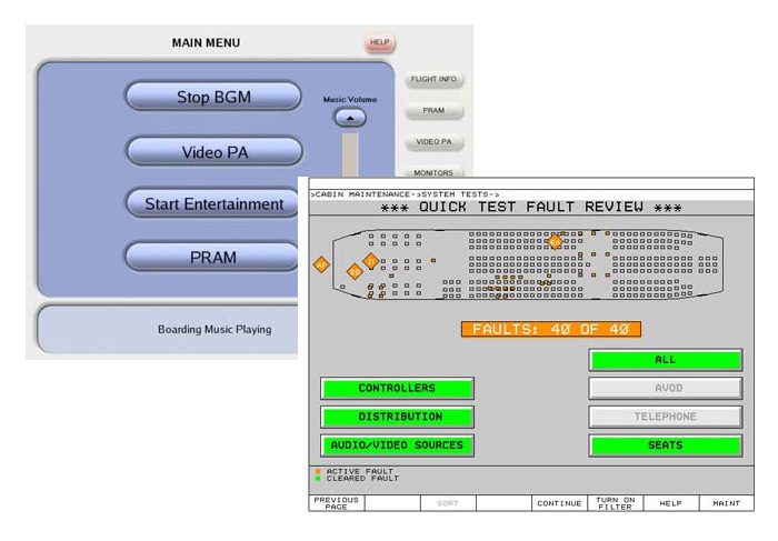
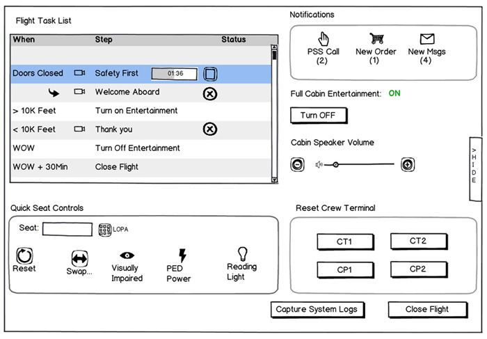
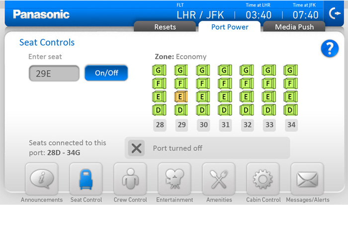
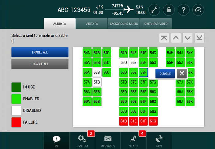
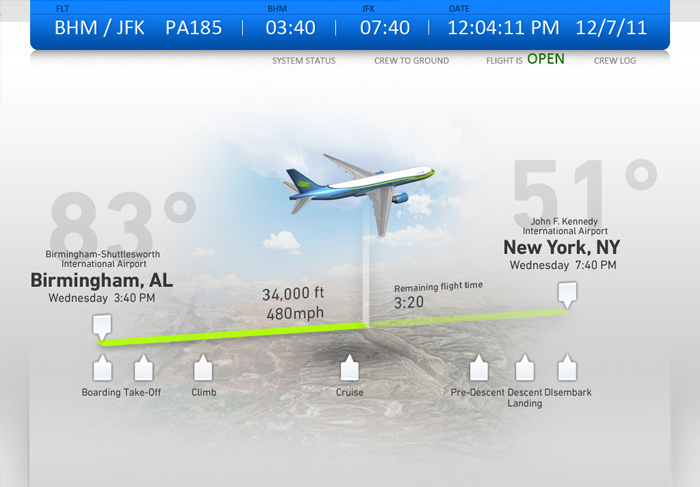
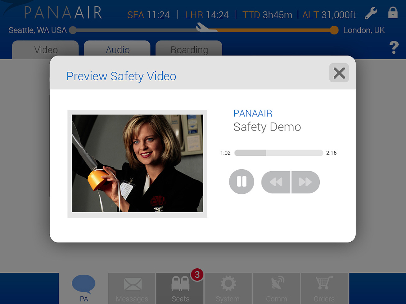
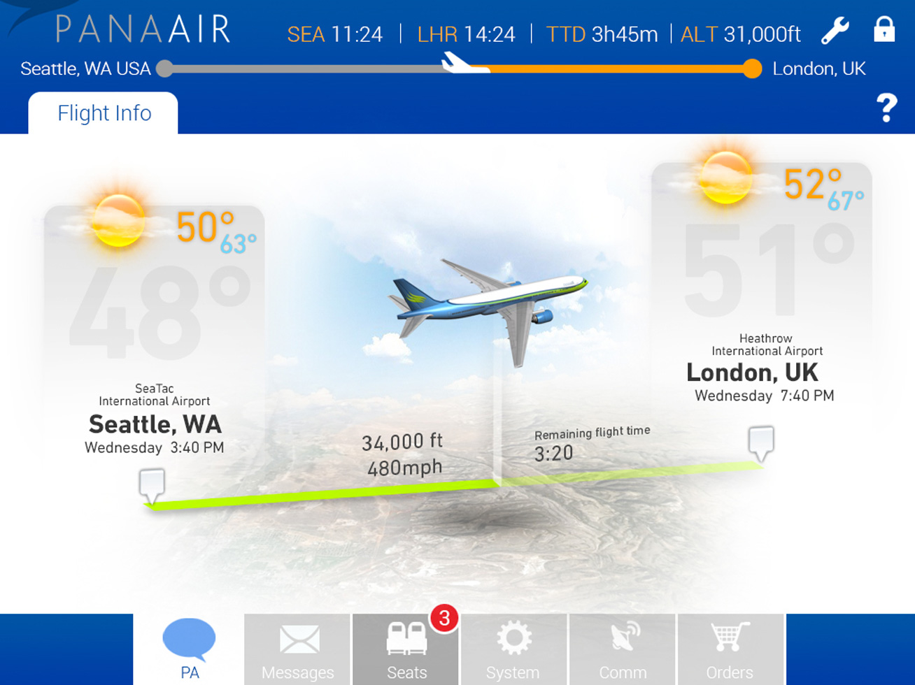
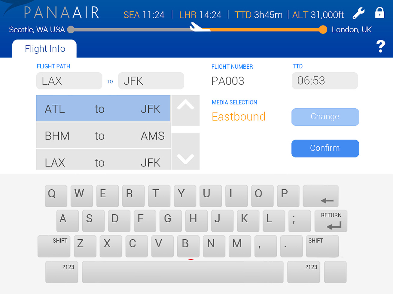
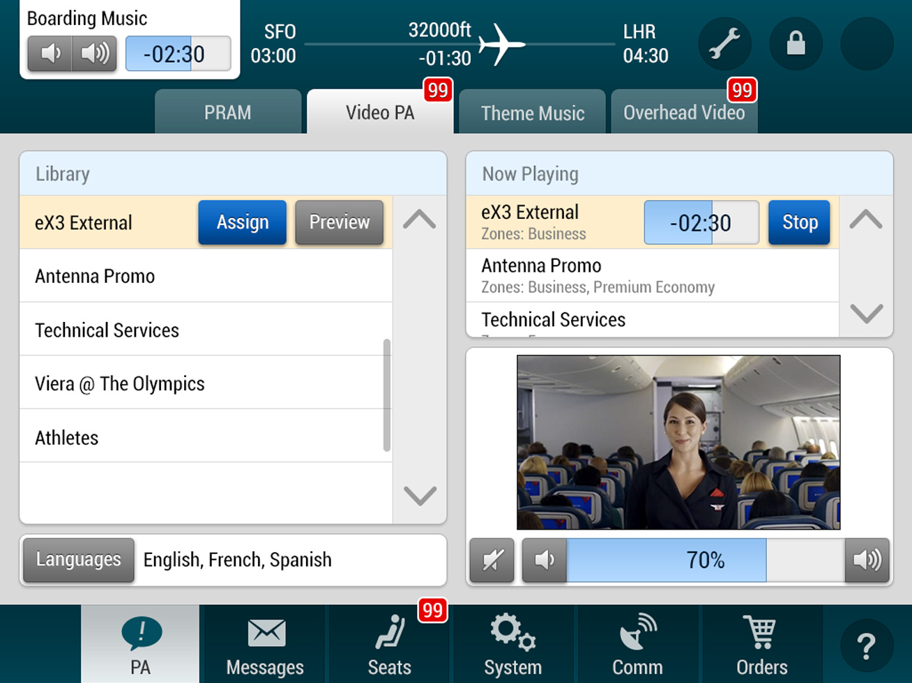
The original crew GUI had a rather flat and uninspiring look, which lacked depth and aesthetic appeal. This design was rooted in engineering sensibilities, resulting in a straightforward yet somewhat bland interface. Two examples of earlier versions of this interface are shown below, both of which are still in use today as legacy systems for several airline carriers.
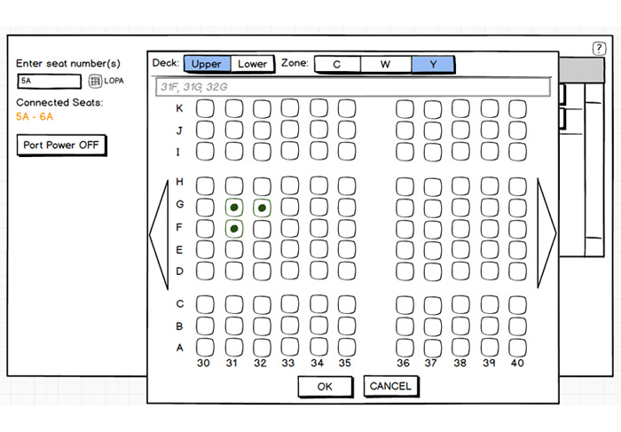
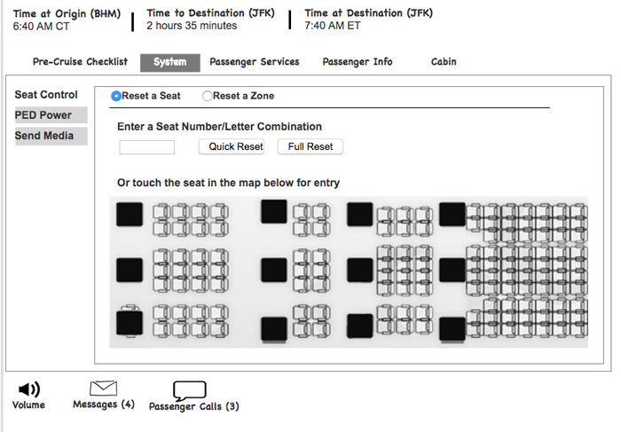
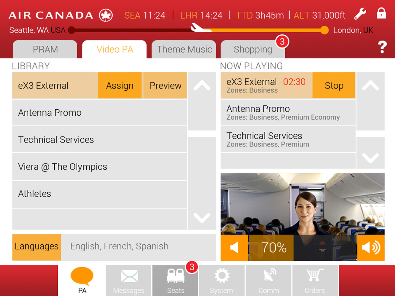
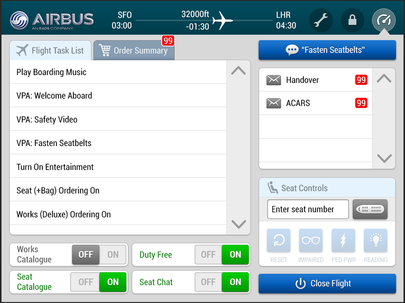
One significant issue with the existing interface was its color palette, which didn't align with the branding colors of the airlines. Instead, colors were assigned based on the type of system. By incorporating the actual colors and visual elements of the airline brand, we were able to bridge this disconnect. While I can only present a generic version due to proprietary rights, it's worth noting that some colors worked better than others in achieving this alignment.