Woodinville Montessori
Both of my sons attended Woodinville Montessori School in Bothell, WA, and as active participants in the school community, we were encouraged to contribute volunteer hours to support the institution. My role as a volunteer centered around leveraging my design expertise within the school's Marketing department. Over time, I had the privilege of working on various projects, including the creation of Annual Reports, designing Yearbook covers, and assisting with the development of other essential school materials. This opportunity not only allowed me to give back to the school but also reinforced my commitment to supporting educational endeavors.

The Process
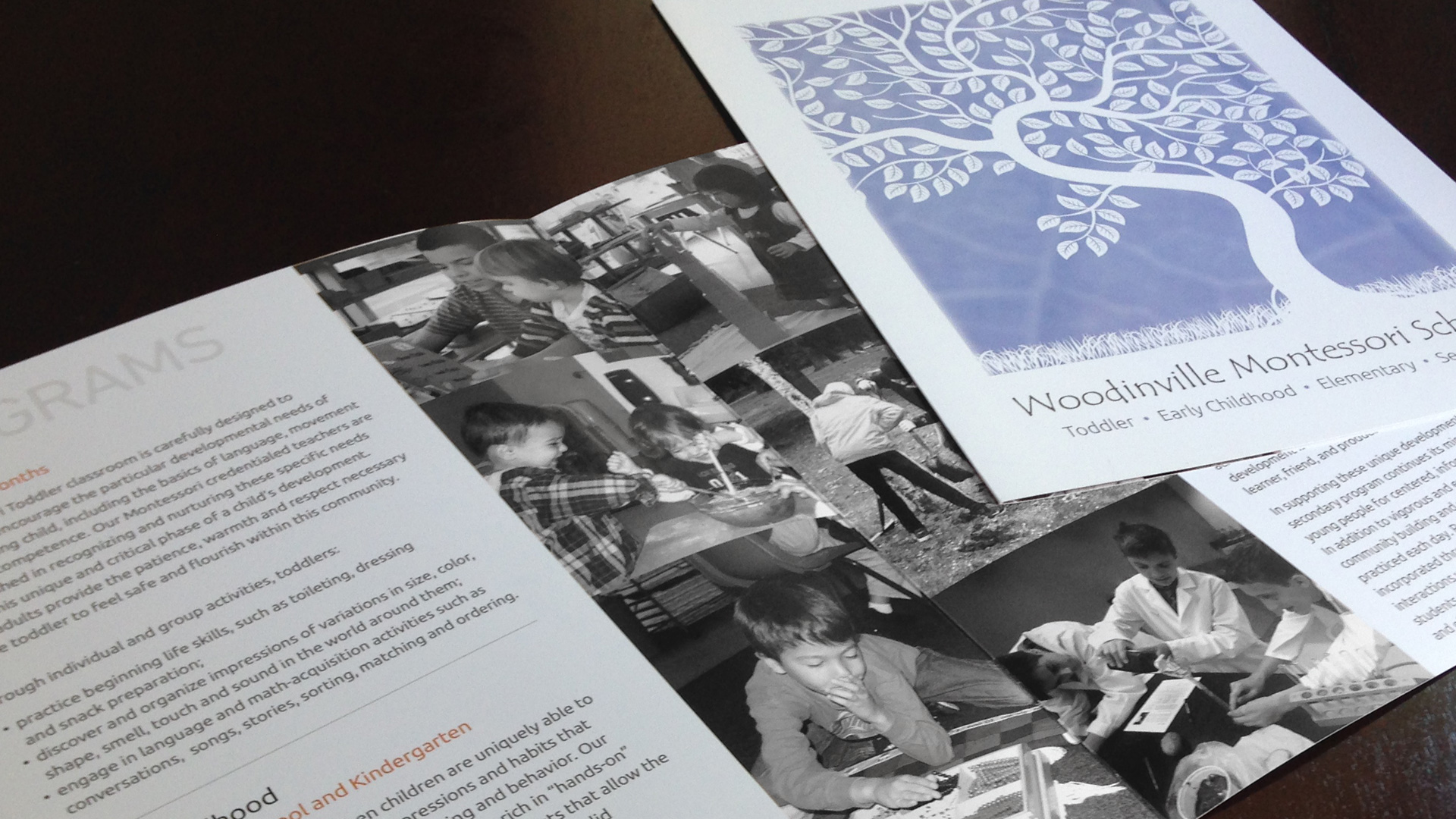
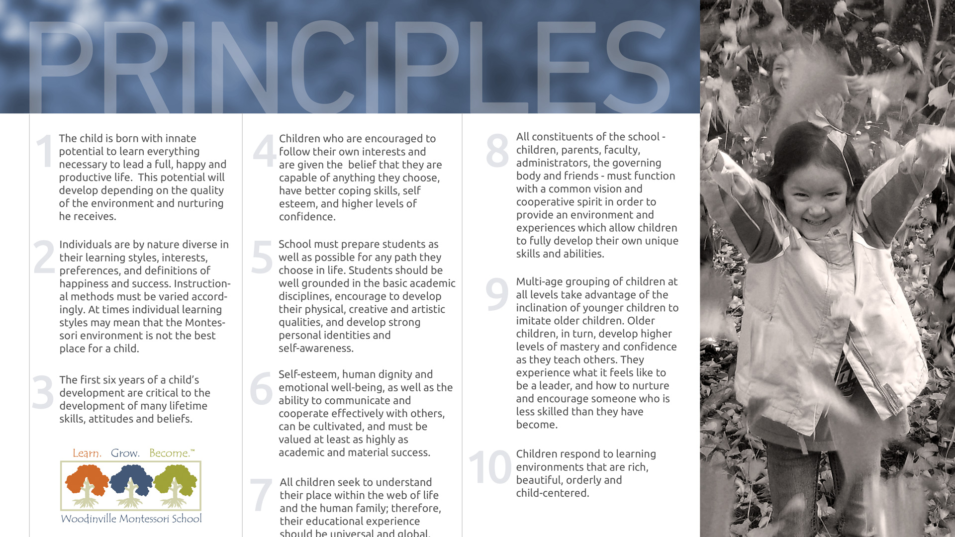
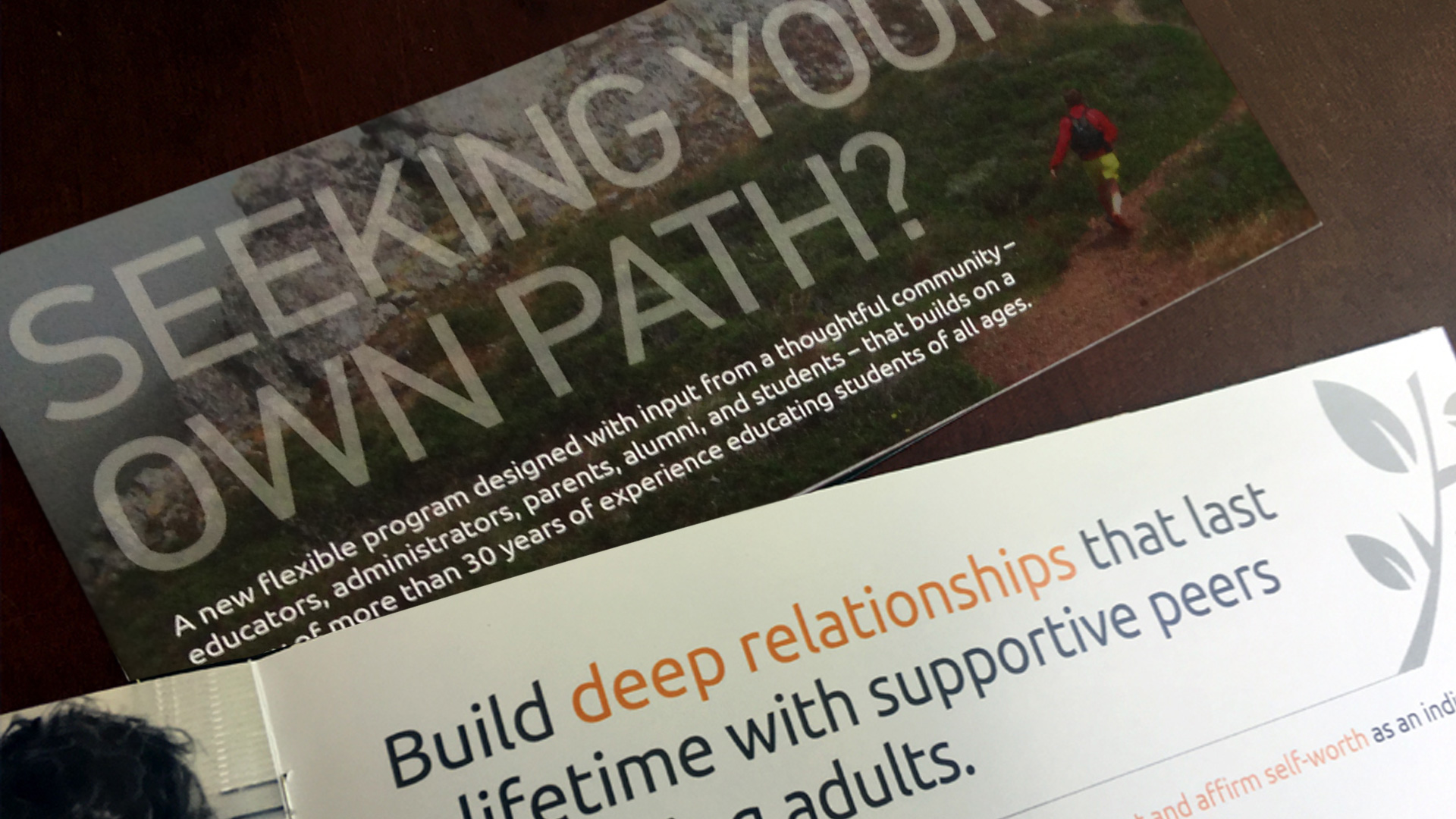
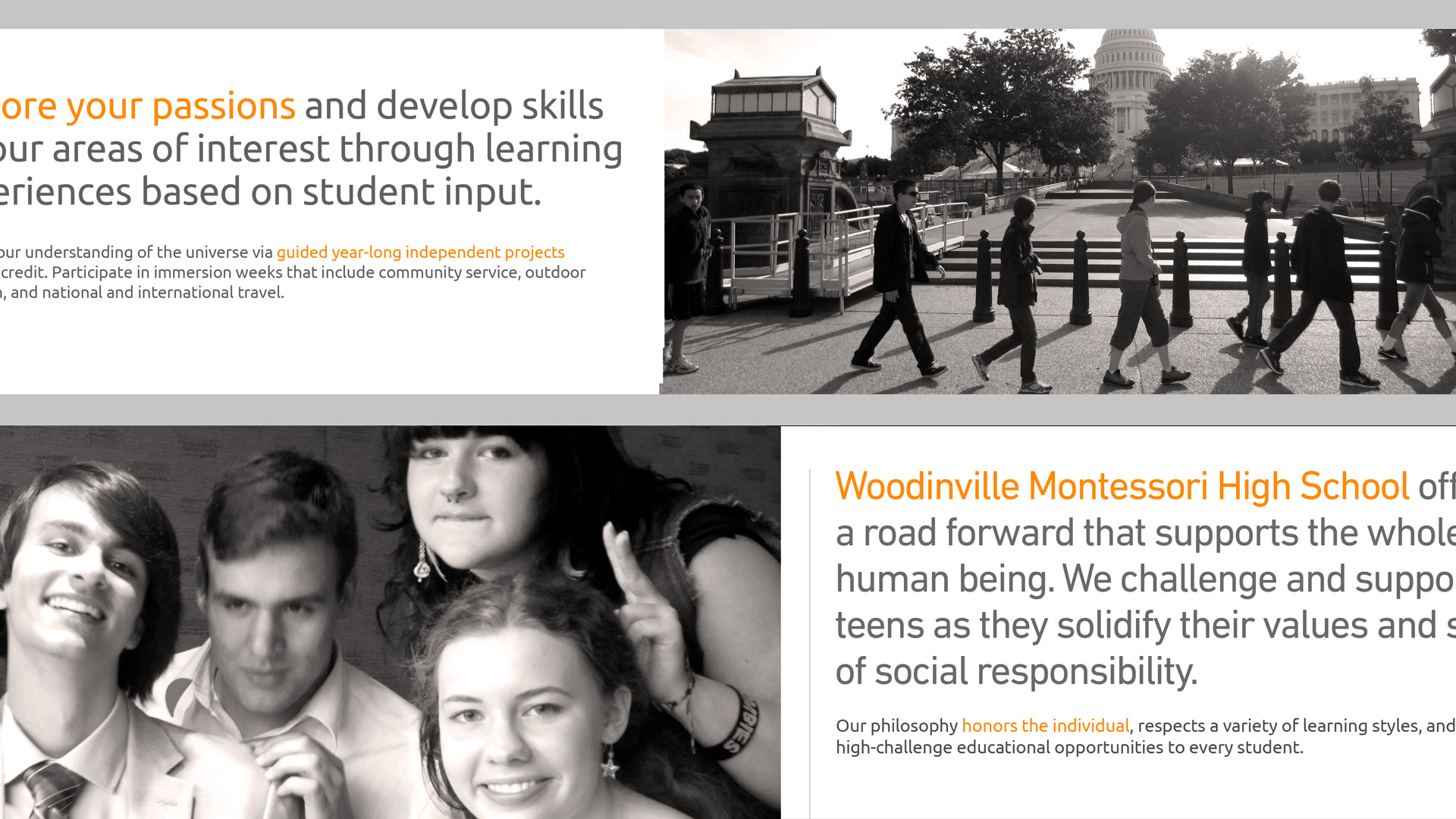
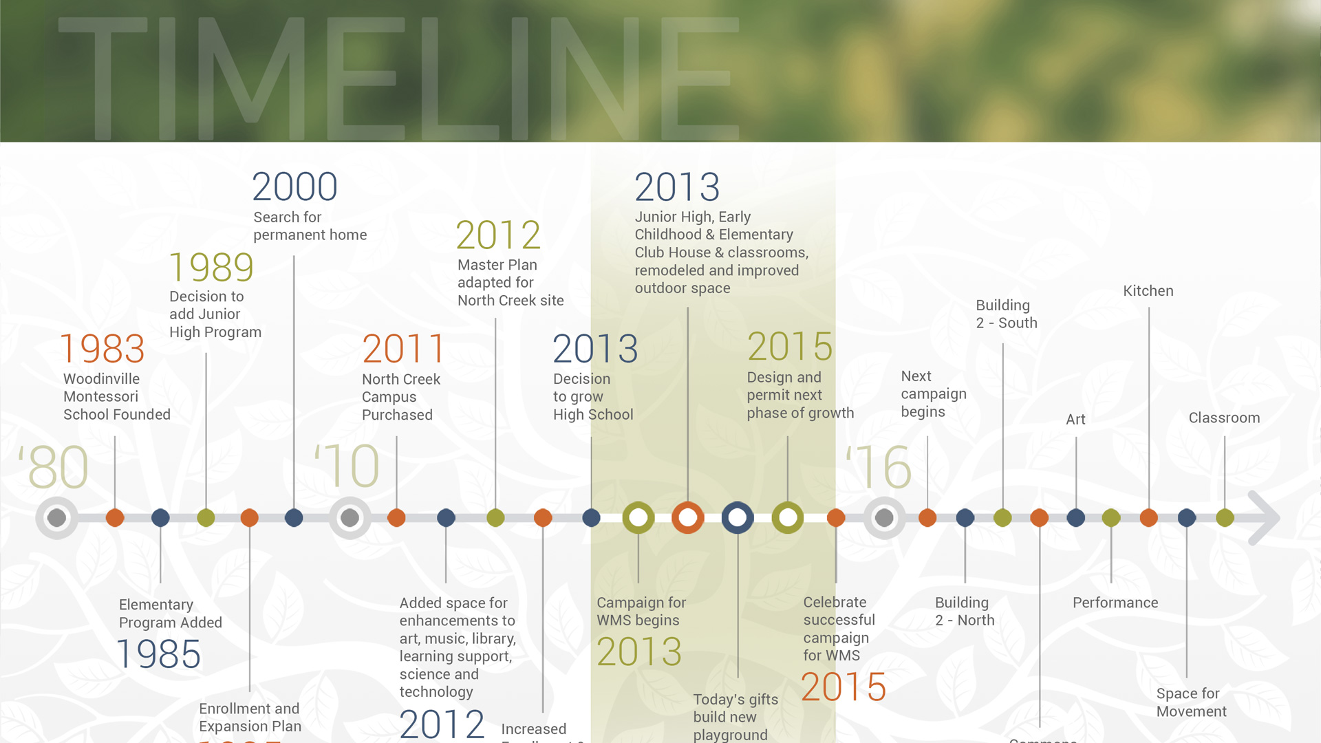
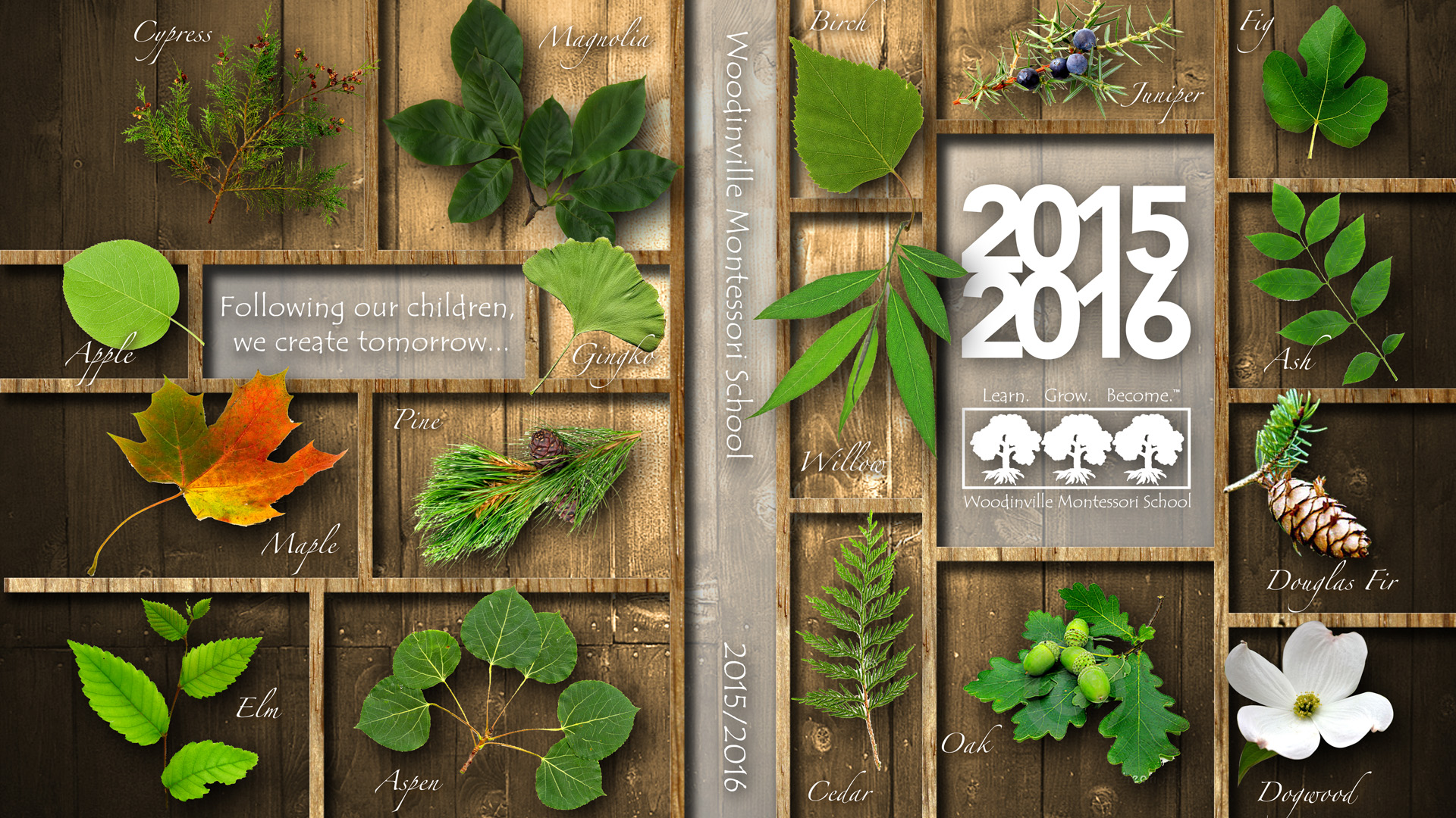
My approach to designing materials for Woodinville Montessori School had consistently focused on achieving a clean and light aesthetic, aligning seamlessly with the content's volume. To accommodate the information effectively, I organized it across multiple layouts, often featuring a dominant color field with one or two carefully chosen photo elements. Typographical headers, with enlarged type stretching across the page width, served as focal points in each layout.
A hallmark of my design philosophy for these materials was the deliberate use of ample white space, ensuring that the content remained easily digestible and visually appealing. In keeping with the school's identity, I adhered to a color scheme that mirrors the logo's palette. This palette, rooted in basic color theory, served as an integral aspect of design education and aligned perfectly with the school's core values.
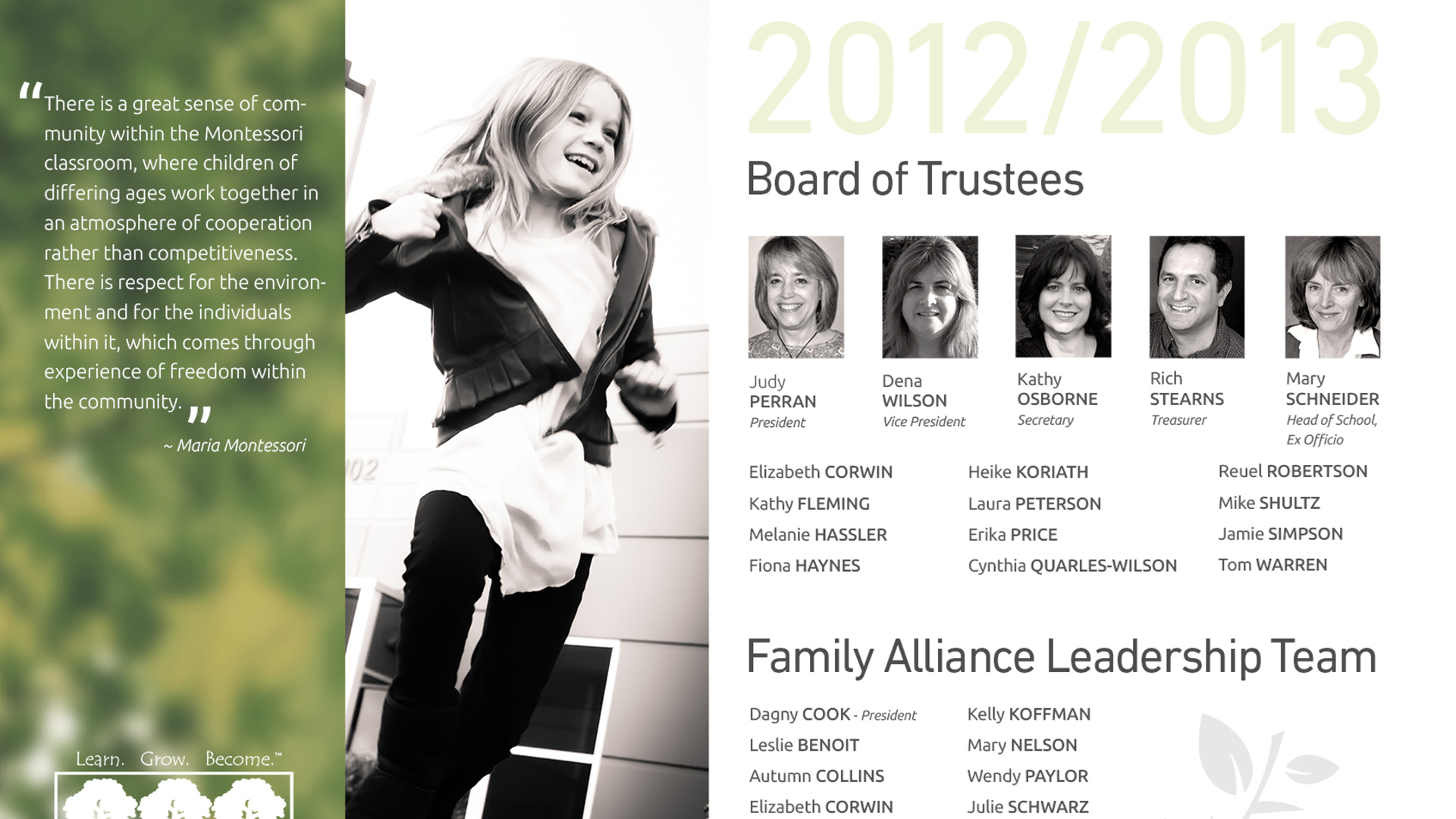
Woodinville Montessori School's logo, featuring three trees, symbolizes the school's mission of fostering personal growth—a message that resonates with the founder's vision of 'excellence in education.' To bring this concept to life, I incorporated the logo's primary and secondary colors. I created an intricate vector illustration of a tree, positioning it behind the two fiscal years. In addition, I used a blurred photograph I captured of a cottonwood tree as a backdrop. This approach imbued the cover with a vibrant, organic green hue, reminiscent of the logo, while maintaining a harmonious balance of white space.
The redesigned clean and elegant aesthetic has garnered widespread acclaim, leading to new assignments for reimagining existing materials to align with this distinct look and feel, reaffirming the school's commitment to excellence in education.
A hallmark of my design philosophy for these materials was the deliberate use of ample white space, ensuring that the content remained easily digestible and visually appealing. In keeping with the school's identity, I adhered to a color scheme that mirrors the logo's palette. This palette, rooted in basic color theory, served as an integral aspect of design education and aligned perfectly with the school's core values.
Woodinville Montessori School's logo, featuring three trees, symbolizes the school's mission of fostering personal growth—a message that resonates with the founder's vision of 'excellence in education.' To bring this concept to life, I incorporated the logo's primary and secondary colors. I created an intricate vector illustration of a tree, positioning it behind the two fiscal years. In addition, I used a blurred photograph I captured of a cottonwood tree as a backdrop. This approach imbued the cover with a vibrant, organic green hue, reminiscent of the logo, while maintaining a harmonious balance of white space.
The redesigned clean and elegant aesthetic has garnered widespread acclaim, leading to new assignments for reimagining existing materials to align with this distinct look and feel, reaffirming the school's commitment to excellence in education.

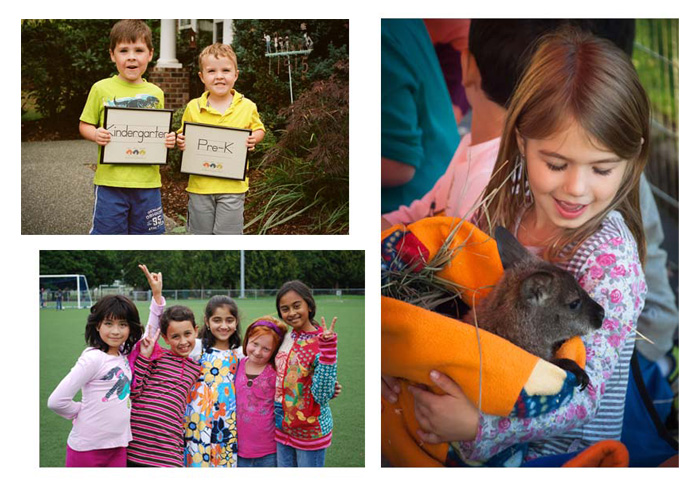
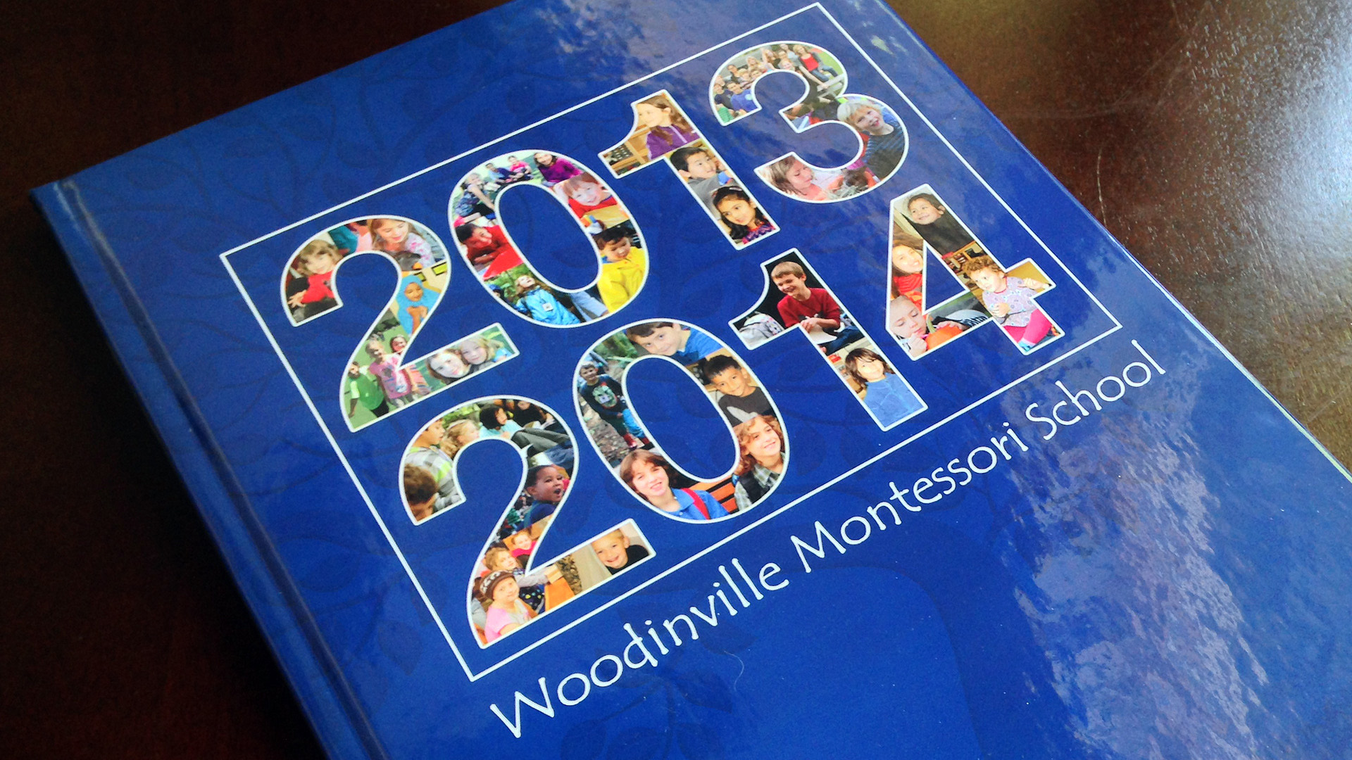
The heart of this project, without a doubt, lies in the subject of the photography—our cherished children. With the limited amount of 'information' to convey, I seized the opportunity to transform each element into a visually captivating piece rather than mere data. My journey began by delving into the treasure trove of photos contributed by school photographers, fellow parents, and myself. From this diverse collection, I handpicked a curated selection of exceptional images, spanning both color and grayscale.
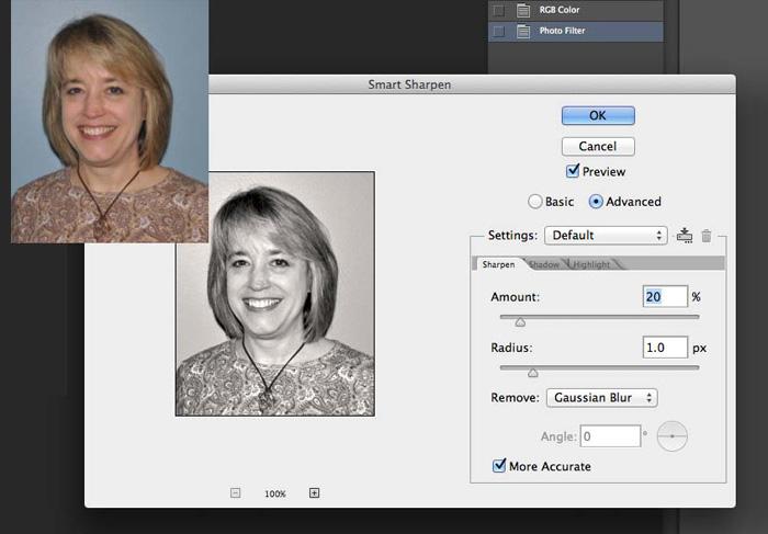
For the Annual Report and High School mailer, I opted for a consistent approach, using 'warmed up' grayscale images throughout the entire project. Some of the photos presented significant quality challenges, prompting me to employ Adobe Photoshop's transformative capabilities. Through careful adjustments to tone and contrast, meticulous sharpening, blemish removal, and the application of a warming filter that mirrored the color of the tree trunks in the school's logo, I breathed new life into these photos. The end result was a collection of images that not only conveyed a consistent aesthetic but also appealed to the viewer's senses.
These photographs captured moments of the children engaged in activities they enjoyed, whether spontaneously captured or posed. Yet, it was the candid moments from their everyday 'play' that proved most captivating. The process of selecting just a handful of images from this wealth of moments was undoubtedly challenging. However, I ensured that each selected image harmonized with the project's overall visual theme, anchored in the color palette inspired by the logo's tree trunks.